Zazzle Media, by Jamie Leeson
Trends are well known changes that happen in all creative fields, and web design is no different. Born of experimentation and innovation, trends are the driving factors for change, which (for the most part) push an industry forward for the better.
The web is a unique environment which is constantly changing and evolving, and with that in mind, here we run down what we believe are 14 of the most important trends to monitor over the next 12 months.
We will be releasing a new design trend each week, keep checking our blog for more updates!
1. More brands adopt a mobile-first approach
As the name suggests, mobile-first design is the process of designing for mobile (or smallest screened devices) first, then working up to the bigger ones.
The mobile-first approach to design isn’t new to 2016 and has been around for a few years now, but with mobile-phones now officially named as the primary devices used for browsing the web, especially in the UK, more companies are realizing the importance of having a site that effectively delivers content on a smaller screen, and are rushing to get onboard.
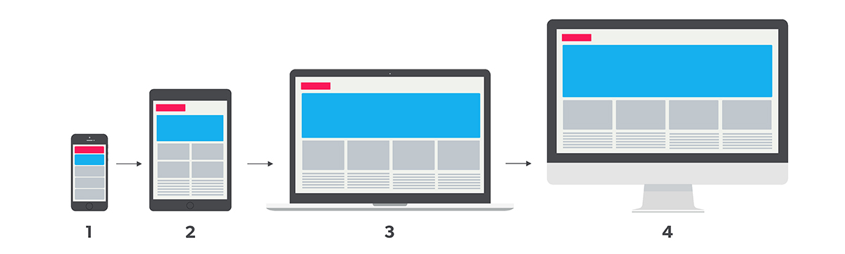
Content is designed to fit on mobile and smaller screened devices first, then you work up towards the larger-screened devices.
Design and visuals aside, the mobile-first model and the restrictions it brings is a useful way for brands to really consider what their core content and message is that they want to communicate.
Smartphones (for the most part) come with significantly smaller screens than tablets and desktops, which limit the amount of content a user can easily view at once. This forces brands to do-away with any information or content which isn’t 100% necessary, allowing them to add it in, along with the additional visual bells and whistles for users as they switch up to larger screened devices.
Our prediction: Mobile-first isn’t a concept new for 2016, but we anticipate seeing more sites over the coming year which take a more thoughtful approach in delivering their content to smaller screens, rather mobile design being a tacked-off after-thought to the desktop build.