Zazzle Media, by Jamie Leeson
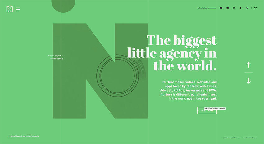
2016 is definitely the year for super-rich colors online. Whereas in the past, many brands and designers have typically stuck with web-safe colors, more brands today are being braver in their approach to using color, as we’re seeing with over-saturation, vibrant hues and a resurgence in the use of gradients. This in part is helped by technological advancements in monitors and devices with screens that are more apt at reproducing richer colors.
The use of bolder colors in web design is helpful in attracting the attention of users, but it’s also a signifier of change for brands, as many make a conscious effort in 2016 to try new things and break new ground, moving away from the previously established, ‘safer-bet’ practices.